LAB
Using visualization to reveal building performance
Previously published on the AIA California Council website, May 8, 2017
Authors: Nathan Brown, M. Susan Ubbelohde
One promise of BIM is that we can track the performance of designs as they develop, helping to design more comfortable and more sustainable buildings. However, challenges arise in translating between the realm of design and the realm of analysis and then back again. If we use an analysis tool that doesn’t address our design questions, we won’t get helpful results. Or, if we see performance as numbers in a table, the data are unlikely to cue us to actions that improve the design.
In our work, the most provocative and influential analyses have two key characteristics: the analysis is framed by a clear design question, and the results are presented using a visualization that addresses the designer, not the engineer. Such visualizations often present data in context, making spatial and temporal patterns visible. Truly engaging visualizations might show the design team answers to questions that no one thought to ask.
Below we present nine examples from our practice of design questions accompanied by visualizations revealing performance.
WHERE DO I NEED SHADE?
The sun moves continuously, and in California’s sunny climate, we need to know how it enters our building over time. This animation of the Windhover Contemplative Center (photograph in introduction) shows the patterns of direct sun entering the small building over a typical day each month of the year. This visualization helped the design team understand the daily patterns of sun and shade for both thermal and visual comfort. Often quantitative analysis can feel divorced from the living reality of building performance and experience. Good visualizations go beyond presenting quantitative results clearly: they animate the results in context so that further relationships and opportunities are suggested and revealed to the design team. (Aidlin Darling Design, Architect)
WILL SHADES BE NECESSARY ON A SUNNY DAY?
The atrium of the American University School of International Service was initially designed for the overcast climate of Washington DC, but there are sunny days as well. How will the atrium perform under clear skies? Will there be glare that is uncomfortable for the occupants? The visualization on the left is rendered in false color in the right image, indicating apparent brightness or luminance from the perspective of an occupant. The images show that the bright patches of direct sun provide vitality and animation in the atrium overall and that shades on the classroom windows, not on the skylight itself, will control sun where needed for visual comfort. While normal daylight simulations can predict illumination levels and distribution, these visualizations are essential to help designers understand what a space will feel like and connect the quantitative performance to experience. (William McDonough + Partners, Design Architect; Quinn Evans Architects, Architect of Record)
CAN WE SPEND LESS ON HVAC EQUIPMENT AND STILL BE COMFORTABLE?
This visualization shows heating and cooling demand required for each hour of the year in a Frog Zero classroom. Each blue dot indicates an hour of air conditioning needed, while each orange dot represents an hour of heating needed. The larger the dot, the more conditioning required and the more energy will be used. As the baseline design is improved with changes in the envelope, building operations and occupant behavior, the HVAC requirements are cumulatively reduced. The largely empty final frame persuasively argues that small amounts of heating are welcome, but that the minimal hours of air conditioning may not be worth the cost of the equipment. The cumulative strategies vastly increased the thermal autonomy of the classroom and allowed the specification of a smaller, more targeted HVAC system. Thermal autonomy is a critical sustainability goal since it represents minimized operational energy as well as resiliency in the event of energy scarcity. (Project Frog)
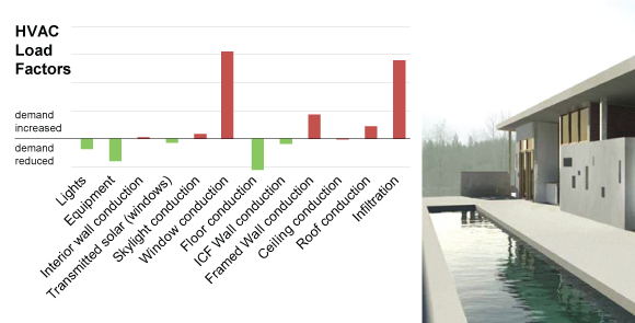
WHAT CAN I DO TO MAKE MY BUILDING WORK BETTER?
We developed this quick analysis and visualization of building performance to help architects identify the design changes that can make the most impact on reducing HVAC loads and energy use. Rather than relying on more general guidelines, the Energy Plus simulation is specific to both the local climate and the design. Analysis of the Douglas City Residence shows that some building components increase loads (red bars) while others decrease loads (green bars). The design team then has a clear path to improve performance; in this case, by specifying a window with a lower u-value and ensuring leaks in building construction are sealed. This visualization is effective because it is linked to direct actions that can be taken by the design team. This is especially useful when time and effort for performance simulations are constrained. (ASUL)
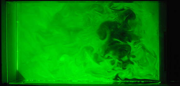
CAN WE NATURALLY VENTILATE A DOUBLE LOADED CORRIDOR?
The animation above shows a wind tunnel test where water vapor has been illuminated with refracted light from a laser to indicate air flow. In this University of Hawaii classroom building, the designers were interested in providing cross ventilation through double-loaded classrooms using large ducts to carry air across the corridor (partial plan at top). The visualization helped confirm the effectiveness in terms of flow rate as well as air distribution. Air movement is especially difficult to simulate accurately. While BIM models have become more integrated with computational fluid dynamics (CFD) simulations, physical testing is still more accurate. In particular, the wind tunnel allows us to see the dynamism and complexity of turbulent air flow. (Ben Woo, Architect; LBNL, Technical Support)
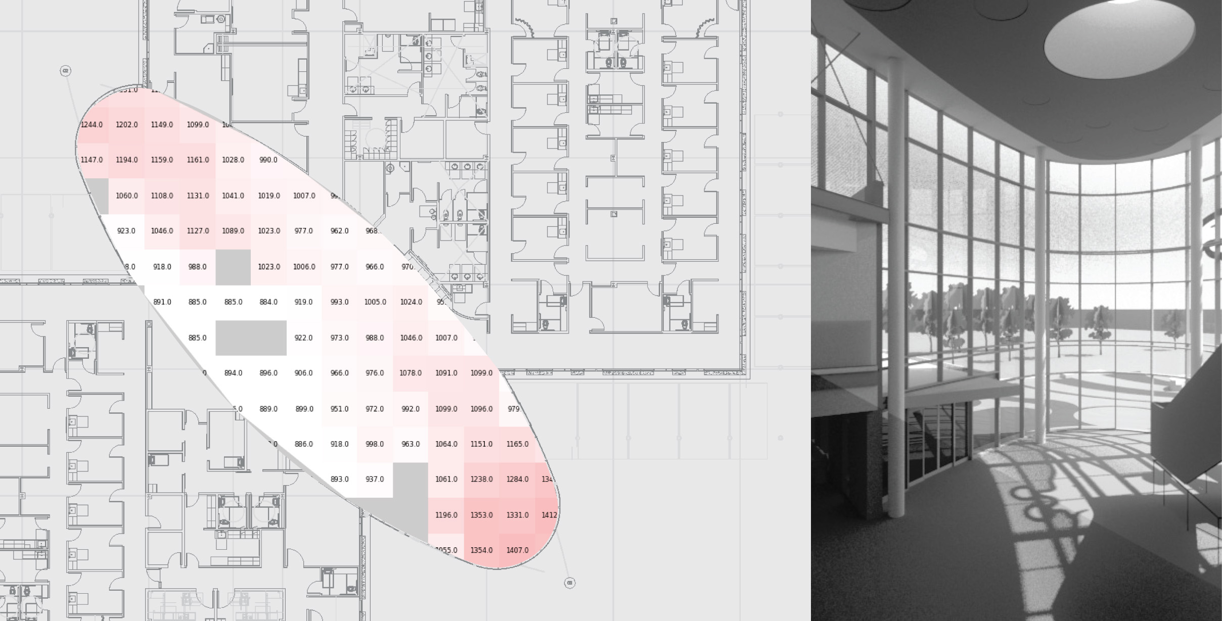
HOW WILL SUN IMPACT THERMAL COMFORT IN OUR ATRIUM?
The human experience of thermal comfort is highly spatial, especially when sitting or standing in direct sun. Above (left) is a spatial map of thermal conditions in a highly glazed atrium (above right). Each grid cell shows the number of hours throughout the year when occupants would feel too warm, including the warmth of sun on the body and also heat from the floor left from earlier sun. This visualization helped the design team compare how alternative glazing specifications improved performance. This analysis also led to radiant cooling located at each end of the atrium to provide comfort for those in the waiting areas. Typical thermal comfort simulations would not have led to this understanding, because they produce comfort values for whole spaces rather than at specific locations in space. (SmithGroup JJR, Architect)
HOW TO NOT FRY AN EGG
A tall new building was causing issues because, while under construction, the curved facade was concentrating sunlight on nearby cars and buildings. Based on our previous experience with solar convergences, we were asked to characterize the phenomena and assist with mediation. It was critical to show that our simulation results were accurate in order to predict performance of the corrective design. The animation shows simulated (left) and observed (right) solar reflections from the building. This visualization helped the team identify the locations where solar convergence was expected so that we could measure the effect on site and calibrate the simulation to predict annual conditions. Ensuring accuracy is an important consideration in identifying a solution to mitigate solar convergence. Visualization is a critical tool to support this, since it reveals patterns and allows comparisons to known reference points.
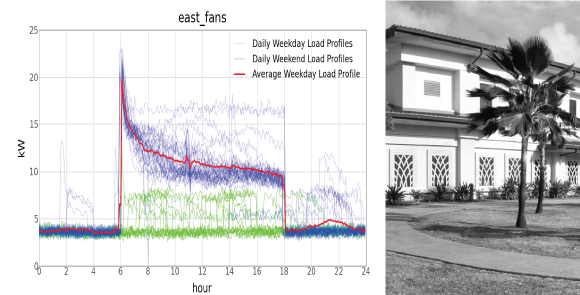
HOW DOES MY BUILDING USE ELECTRICITY?
Building monitoring of the Kauai Police Facility (right) produced data for these visualizations that reveal the typical and extreme use patterns for the facility. The graph at left shows electrical demand for a set of fans for each day, as well as the average weekday load profile. This analysis allowed the team to develop energy retrofit approaches that could address patterns of use unique to this police facility. Visualizations that include more detail while also maintaining readability are key. Without each individual day represented above, it would not be clear that the facility experienced spikes of use in the evening or that midday energy use varies significantly. These atypical conditions are crucial for designing mechanical retrofits that address real performance.
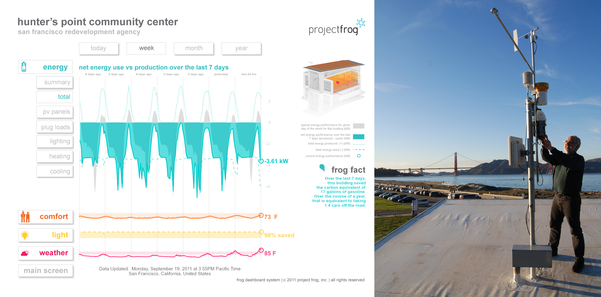
HOW IS OUR BUILDING PERFORMING?
A building dashboard is much like a car’s dashboard, providing real-time visual information on the performance of the building, including energy use, energy generation, thermal conditions, lighting, water collection and use, as well as local weather. This dashboard is a predecessor of the Crissy Field Center Dashboard, installed at the Project Frog building at Crissy Field. Using data collected by the building monitoring system, this tool allows the user to see patterns of variation within a single performance measurement (for example, energy) and also to compare these patterns to the patterns in other variables. The Crissy dashboard has revealed many insights to building users and owners, including how underfloor air heating is working, whether a rainwater collection system is functioning properly, and how well wind turbines are producing energy. Without the ability to visualize patterns and make comparisons, these and other insights would not have been discerned.
Lab Details
Original Publication: AIA California website, May 8, 2017