EXPERTISE
Google Bay View Campus
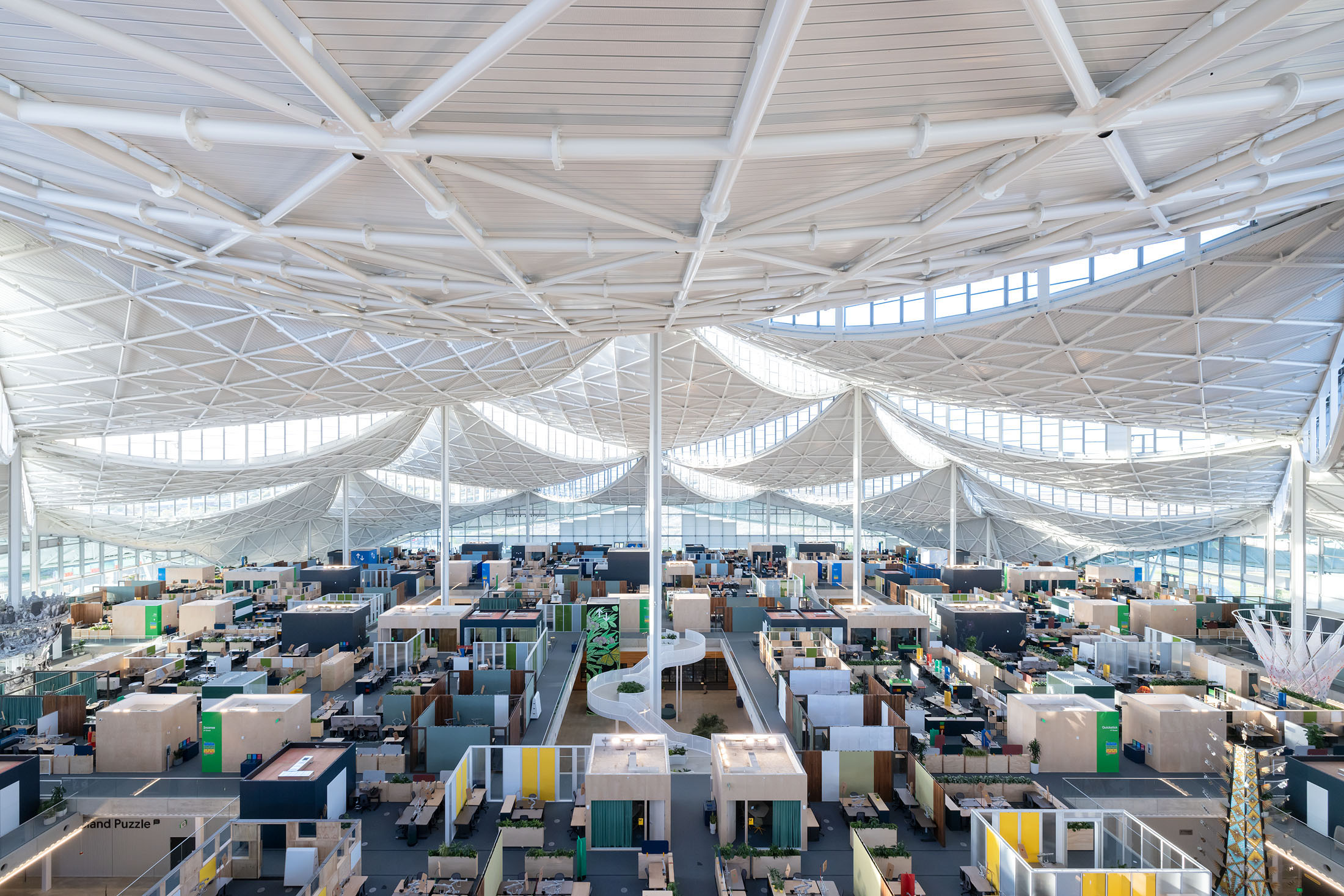
The design for this tech office building in the heart of Silicon Valley consists of large, airy canopies spanning over expansive work areas. The workspaces are elevated on “trays” that define project teams and amenity spaces such as meeting rooms and break areas are located around interior courtyards on ground level. The intent is for apertures in the canopy to provide a good working light while connecting Googlers to daylight and the movement of the sun and clouds. Far from a typical office environment, this typology has a strong affinity with large-span structures such as railroad stations, industrial manufacturing facilities, and atria. In comparison to these other uses, however, the majority of the Googlers spend their time looking at computer screens.
SERVICES
• Predict and evaluate illumination levels and light distribution
• Predict and analyze luminance gradients and glare potential
• Analyze thermal and energy use implications of daylighting design
• Design and evaluate daylighting to exhibition and curatorial performance criteria
• Predict energy savings from daylight harvesting
• Coordinate daylighting and electrical lighting design
• Post-occupancy HDRI analysis of luminance and visual comfort
See examples of our Daylighting Projects →
• Analyze visual performance of glazing alternatives
• Evaluate advanced glazing applications, including light redirecting glass and internal shading systems
• Predict and evaluate thermal performance of curtain wall systems
• Predict occupant comfort conditions for curtain wall alternatives
• Identify and coordinate value engineering tradeoffs for integrated high-performance facades
See examples of our Glazing Selection Projects →
• Analyze site conditions for solar access and shade potential
• Design sun control and glare control alternatives for local skies and climate conditions
• Evaluate shade alternatives for visual and thermal comfort
See examples of our Shading Design Projects →
• Characterize reflections to understand temporal and spatial patterns
• Use calibrated simulations of solar radiation to quantify intensity and distribution
• Design and evaluate mitigation alternatives
See examples of our Solar Reflections Projects →
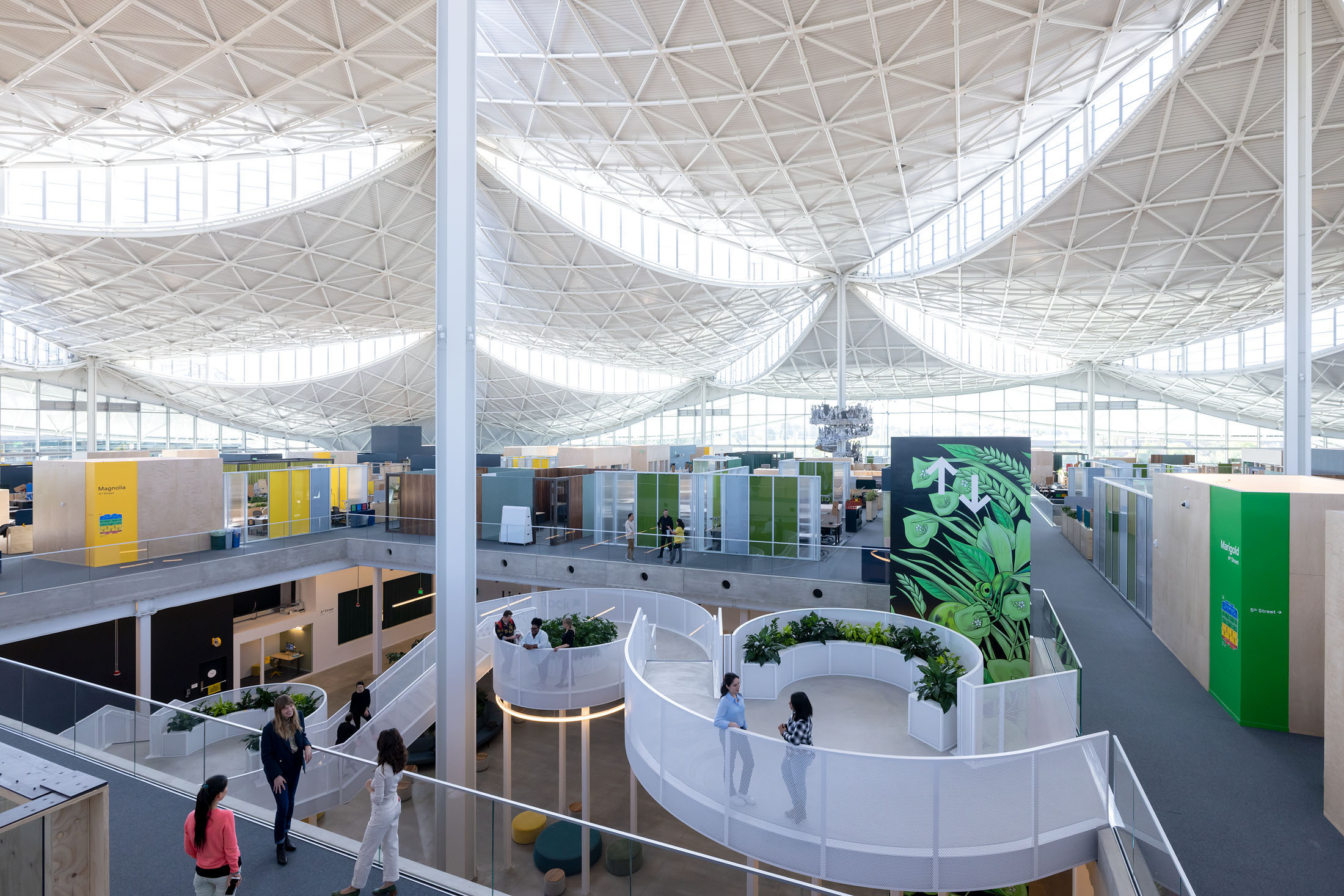
One workplace under a giant roof with daylight and views for all. Each neighborhood is organized around an internal courtyard and a flexible partition system allows differing amounts of privacy and team definition.
AWARDS
LEED Platinum Certification
2023 ULI Americas Awards for Excellence
2022 ENR Best Global Project – Project of the Year and Best Office
2022 CoreNet Global, Award for Sustainable Leadership in Corporate Real Estate
2021 Silicon Valley Business Journal Structures Award, Green Project Award
2022 Silicon Valley Business Journal Structures Award, Best Campus Project Award
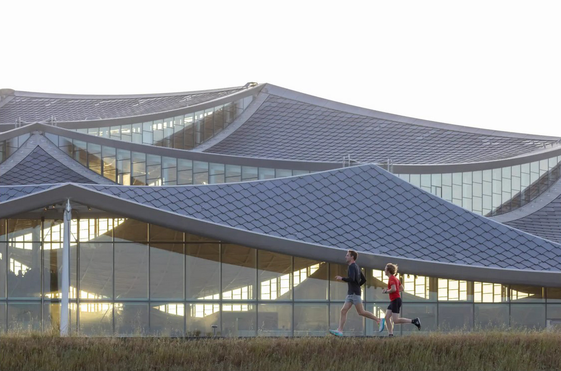
View from the public trail that encircles the site adjacent to NASA’s research facility.
Circulation space around and through a courtyard designed to foster chance interactions.
To reconcile these disparate notions, the design incorporates a series of smaller scale interventions that allow occupants to customize their luminous environment. Fabric shades automatically deploy to cut direct sun from the clerestories only when solar geometry and sky conditions dictate. In parallel, human scale elements can be used to mediate the ambient light levels and mitigate potential sources of discomfort on a case-by-case basis. Options include a demountable and customizable partition system, and a similarly flexible workstation with demountable shade panels.
What We Did
Performance metrics benchmarks
Local sky conditions analysis
Building parti for daylight
Building massing options
Overhang sizing
Interior light levels for vegetation
Interior finishes for visual comfort
Dynamic shade controls and fabric specifications
Custom shade schedules for targeted sun
Alternative shade materials and smart glass testing
Glass specification for daylight and comfort
Glass frit design
Electric lighting and daylight integration
Interior partitions and furniture layouts for comfort
At-desk glare control design
View access analysis
Exterior building reflection and glare analysis
Material testing for exterior glare mitigation
LEED documentation
Shop drawing review
Shade and wallswitch zoning
Light quality and occupant comfort commissioning
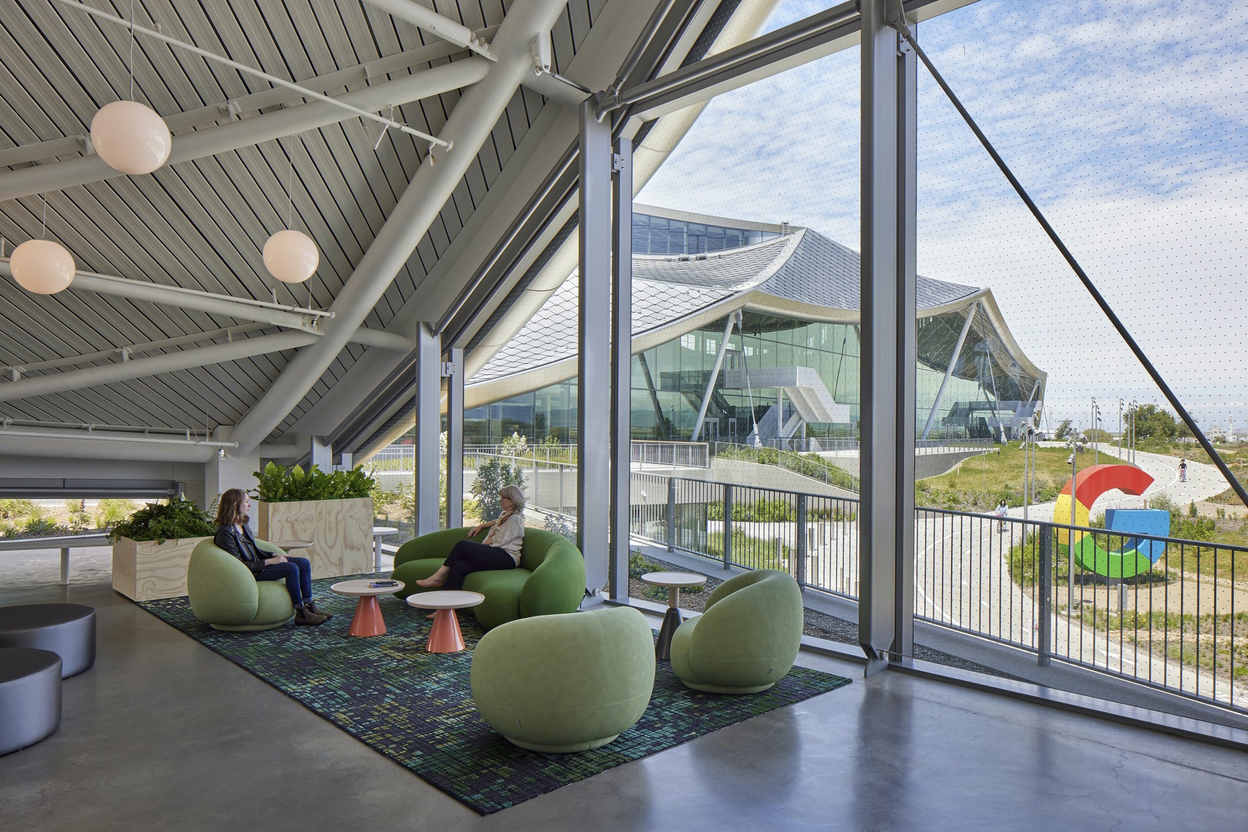
Lounge where the roof canopy touches down at the ground. The facade glazing has a frit pattern that is designed to reduce bird strikes. In a nod to the company, the frit is designed as binary code.
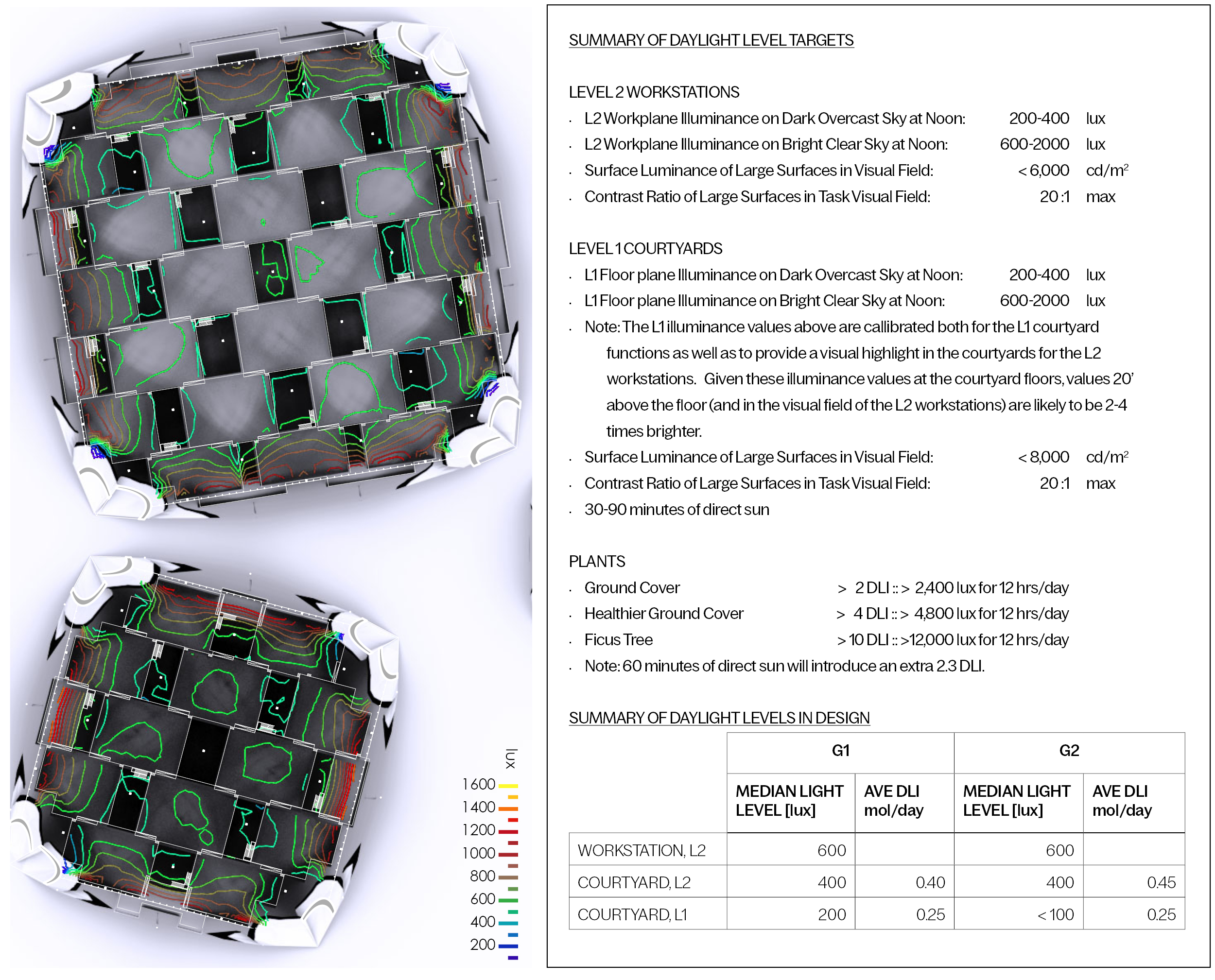
Because of the unique configuration of the program and building envelope, we revisited the owner-supplied project requirements and defined project-specific visual comfort recommendations responding to the context of this specific design and a user’s expectations. Visual comfort depends on several phenomena including the visual task, brightness and size of materials in the visual field, contrast ratios, adaptation, expectations, and physiology. In benchmark spaces we found that both the relative illuminance and luminance in the field of view to be important, as well as the absolute levels. Based on measurements and experiences in these benchmark spaces, we developed customized daylight performance recommendations.
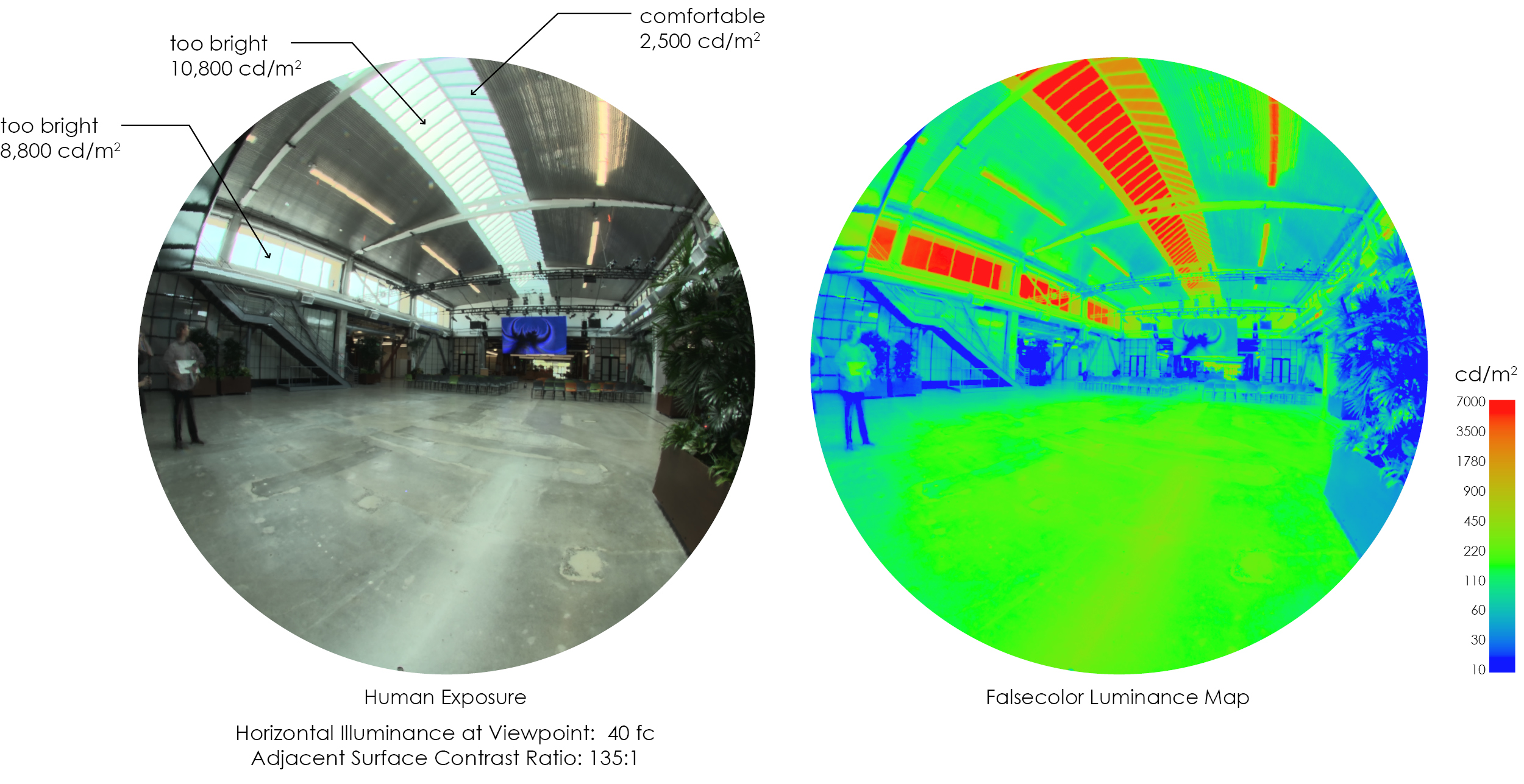
This benchmark space was generally comfortable with appropriate light levels for office work. Clerestory windows and skylights were uncomfortably bright in places. The dark ceiling yields a high contrast with the skylights and clerestories. While not ideal, this was not a source of discomfort.
We measured several high-bay spaces that the client knows and likes, selecting spaces with similarities to the proposed design in terms of clerestory windows, skylights, and multi-story atria. The benchmarking report presents critical daylighting metrics in these spaces and then relates these metrics to simulations of the current design. Measurements were taken using calibrated HDR photographs and on-site spot illuminance measurements.
In the benchmark spaces we found that both the relative illuminance and luminance in the field of view to be important, as well as the absolute levels. Our measurements and on-site experiences lead us to make the following general recommendations for Charleston East and Bay View:
In studying the daylight at Bay View, as in most buildings we analyze, the goal is to get a sense of the amount of light admitted by the building envelope under a range of sky conditions. Our simulation results quantify the amount of light falling on interior surfaces under a variety of site specific sky conditions.
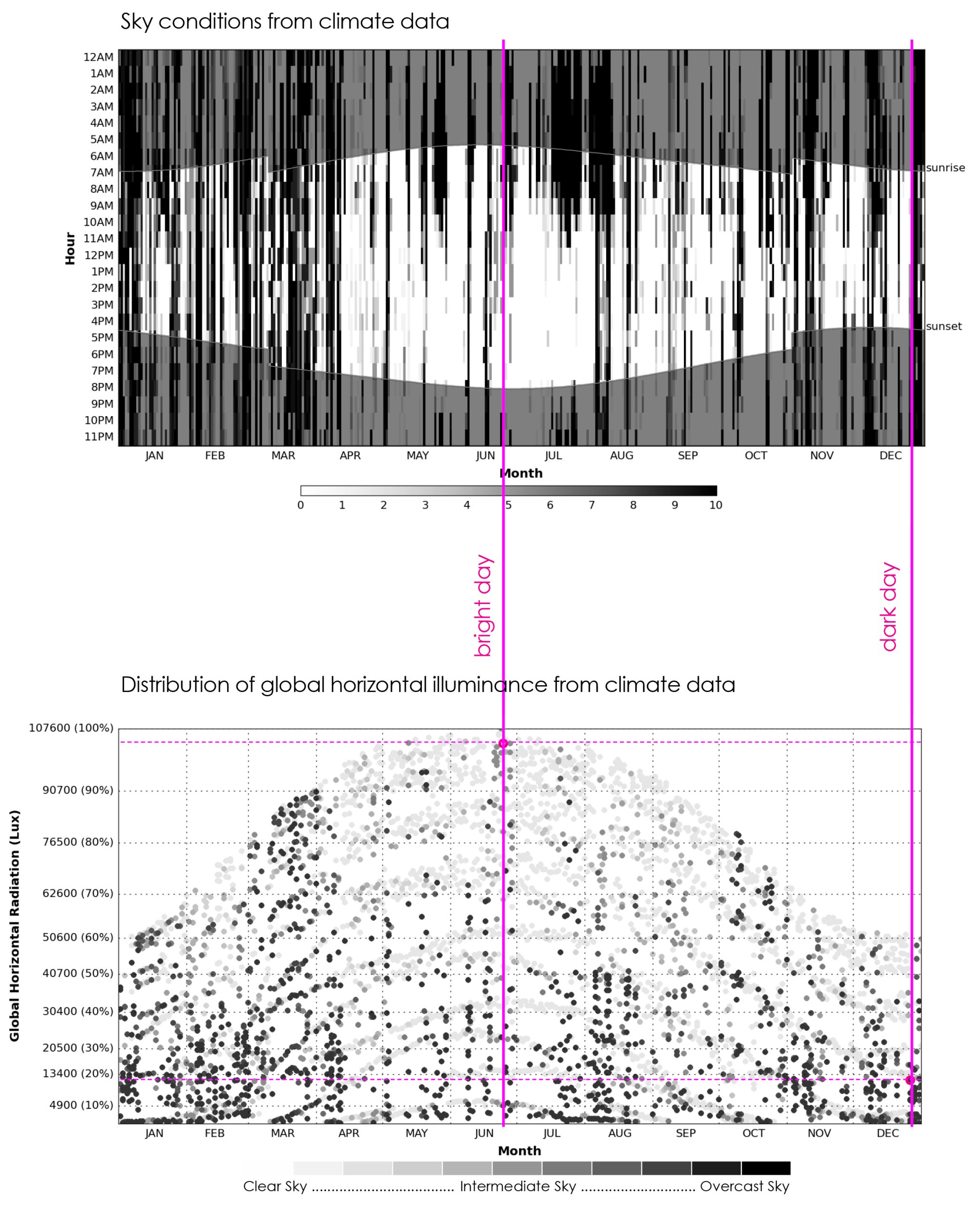
We modeled and ran simulations using Radiance, a research grade lighting simulation tool based on the physics of light and material properties. Our models were calibrated with local sky and climate data from Moffett Field, which is about 2 miles east of Charleston East and 100 yards east of Bay View.
Simulations were run for every daylight hour throughout the year using TMY data (Typical Meteorological Year). A typical dark day (December 26, 2004) and a typical bright day (June 24, 2005) were selected to gain an understanding of the boundary conditions.
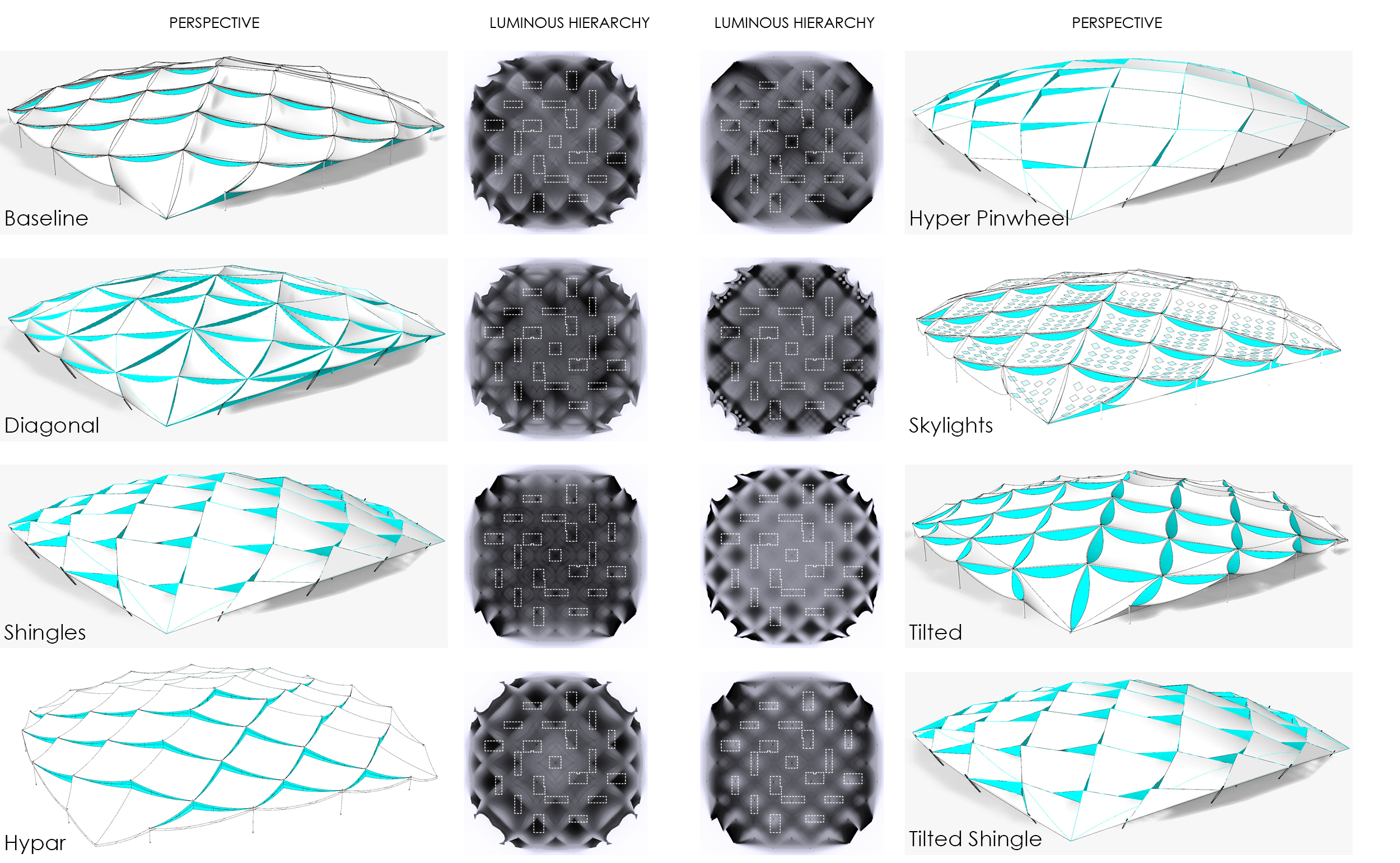
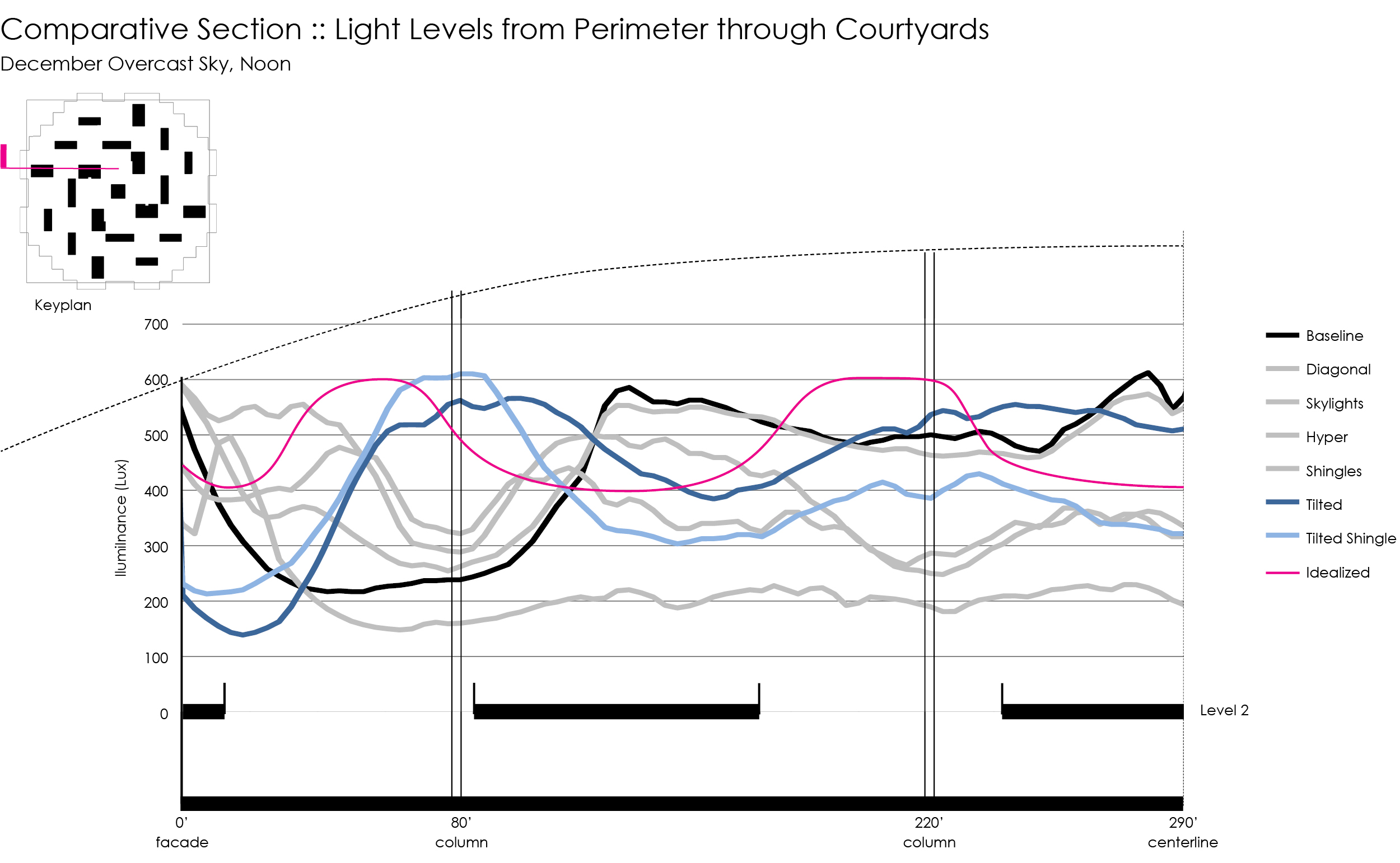
In the initial architectural design, interior daylight levels met industry standards but there was concern that they were a bit low compared to what occupant expectations for a long-span structure might be. In addition, perimeter daylight levels were extremely low owing to the large overhangs. Internal courtyards also did not have enough light to support the large trees that were planned. We tested several variations on the canopy geometry to help lighten up the interior experience and create a luminous hierarchy consistent with the programmatic organization.
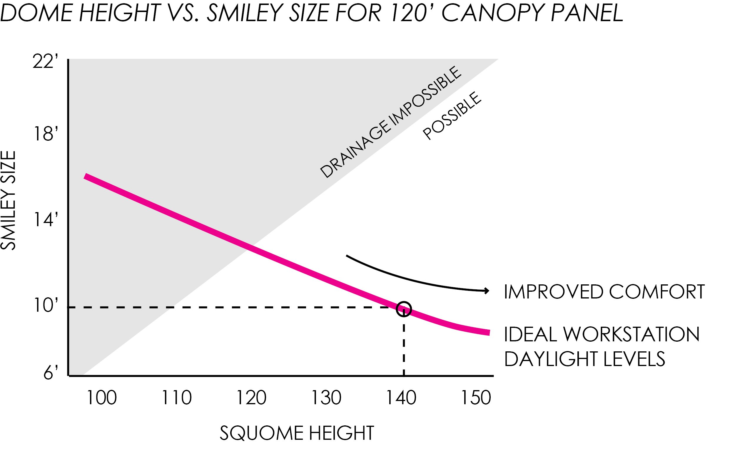
As the canopy geometry was refined, we were asked to determine the optimal size of the clerestory windows along with the height of the canopy. In addition to visual comfort criteria, we needed to take into account the minimum drainage requirements as well as potential energy production from BIPV shingles.
Based on parametric simulations, we determined that as the canopy gets higher and steeper, the clerestory windows can be smaller and still deliver the same amount of illumination to the workstations below. Likewise, as the clerestory windows get larger the canopy can be lower and flatter. Furthermore, as the squome gets higher, the contrast ratio between sky and ceiling lessens, creating a more comfortable environment.
Early design simulations with illuminance countours overlaid on perspective renderings. As the canopy increases in steepness (from left to right) light levels increase.
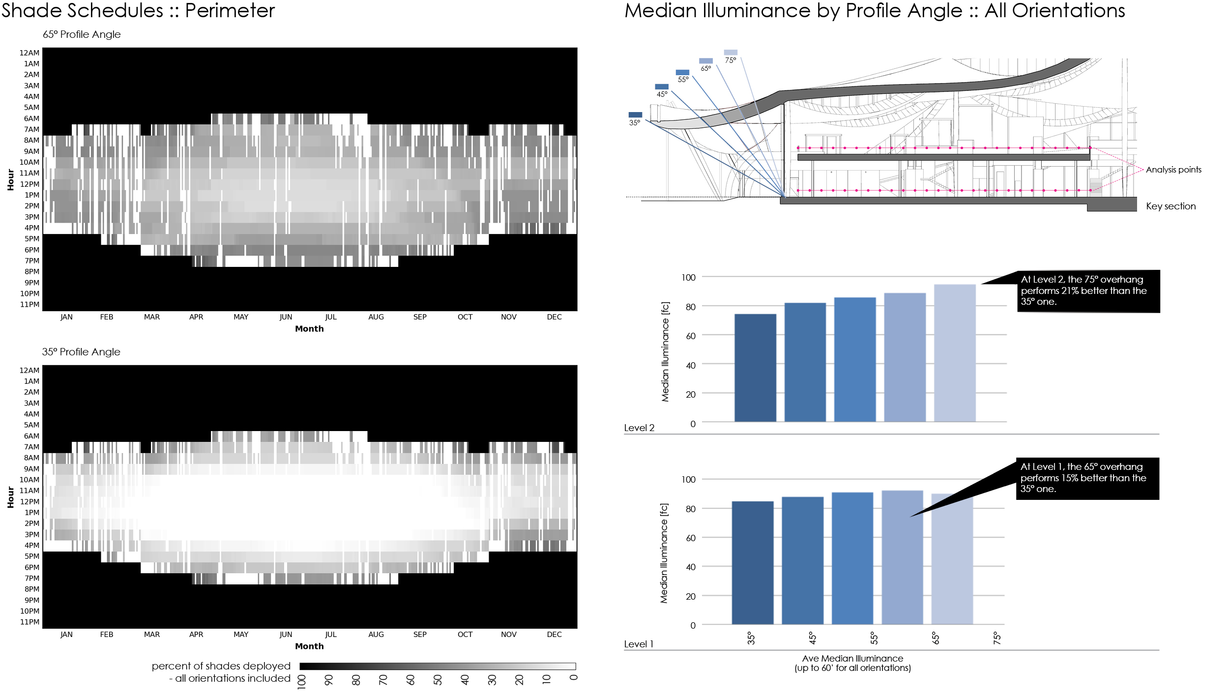
As we refined the roof shape we studied the impact that large overhangs would have on daylight levels and visual comfort. The symmetrical design demanded a consistent treatment on all four sides, regardless of orientation. We determined that an overhang with a profile angle between 55° and 65° resulted in significantly more light and less glare on both levels 1 and 2. If the program on level 1 could allow for direct beam penetration (and shades can remain retracted), a 75° overhang would be optimal. However, when these angles were vetted with the mechanical engineer, they determined that dramatically longer overhangs were required to reduce solar loads on the mechanical system.
The selected canopy design provides relatively uniform daylight levels throughout the second level of the building. In fact, the luminous aesthetic is evocative of an overcast sky: the canopy panels float like clouds overhead and their white-painted surfaces effectively diffuse and redirect light out over the second level. The daylight levels fluctuate with changing sky conditions, but the patterns of daylight are relatively constant.
This character is modulated in some courtyards where direct sun can be introduced. These moments of sun give a sense of hierarchy and variation to the building as a whole. They also provide sparkle and animation, introduce moments of warmer light, and connect the occupants to the movement of the sun.
Integral to these strategies is a high degree of automated control over light diffusion for both the clerestories and the perimeter glass facades. We recommended that motorized fabric shades be used to: (1) eliminate direct sun at workstations, (2) selectively allow direct sun into courtyards, (3) mediate views to the bright sky, (4) maximize usable daylight when sun is not present, and (5) reduce electric light egress at night.
Overcast sky
Overcast sky with selective sun
Early design phase simulations studying the importance of direct sun into the courtyards.
Moderating the character of the daylight over the courtyards provides an experiential compliment to the workstation areas. Introducing some direct sun into the courtyards creates hierarchy and gives some relief to Level 2 as a whole, provides sparkle and animation, introduces moments of warmer light, and connects the occupants to the movement of the sun.
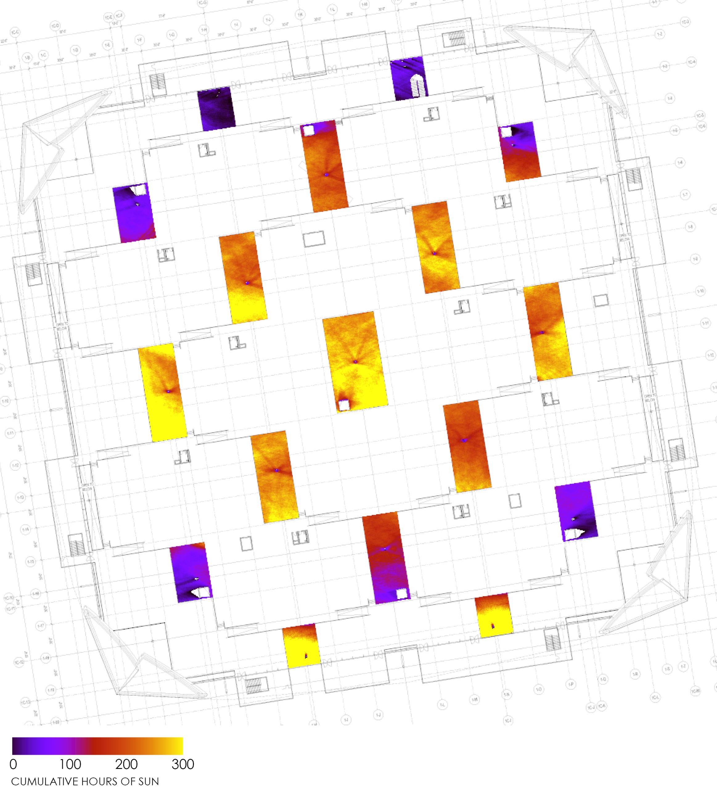
The images above show sun availability in the courtyards. The animation on the left is a map of when clerestory shades can open according to the angle between the sun, the shade, and the courtyards on April 28. A schedule was generated for each shade motor for every day of the year where green is open and red is closed. The image on the right shows cumulative hours of sun for all courtyards throughout the course of the year.
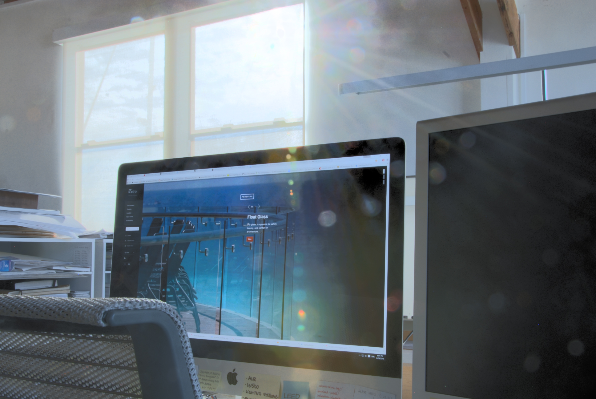
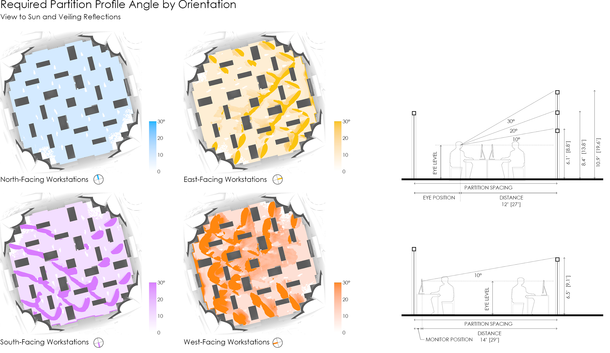
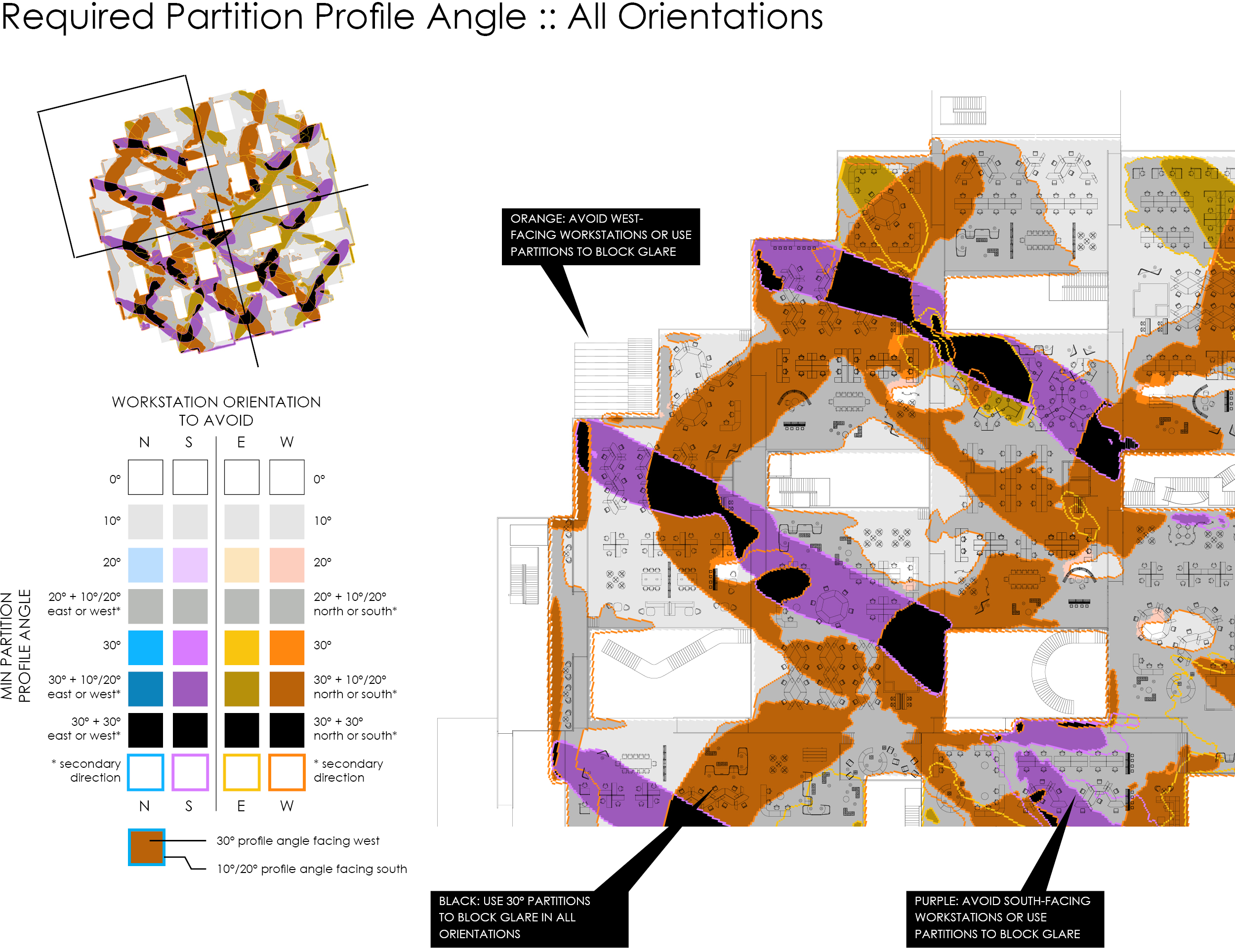
Because of the open floor plan, floor to ceiling perimeter glass, and high clerestory windows, most workstations on level 2 have some uniquely challenging visual comfort conditions. We highlighted two potential issues: views to sun through deployed shades and monitor screens that reflect the bright clerestories behind a workstation.
View to the low-angle sun through shades occurs in selective locations across level 2 and during limited hours of the year. Most workstations are exposed to less than 1 hour per day of these views, but in our estimation, more than 10-15 minutes will be increasingly annoying. Occluding these views can be accomplished with various methods including partition size and layout, workstation-integrated and user-adjustable glare control, and workstation orientation.
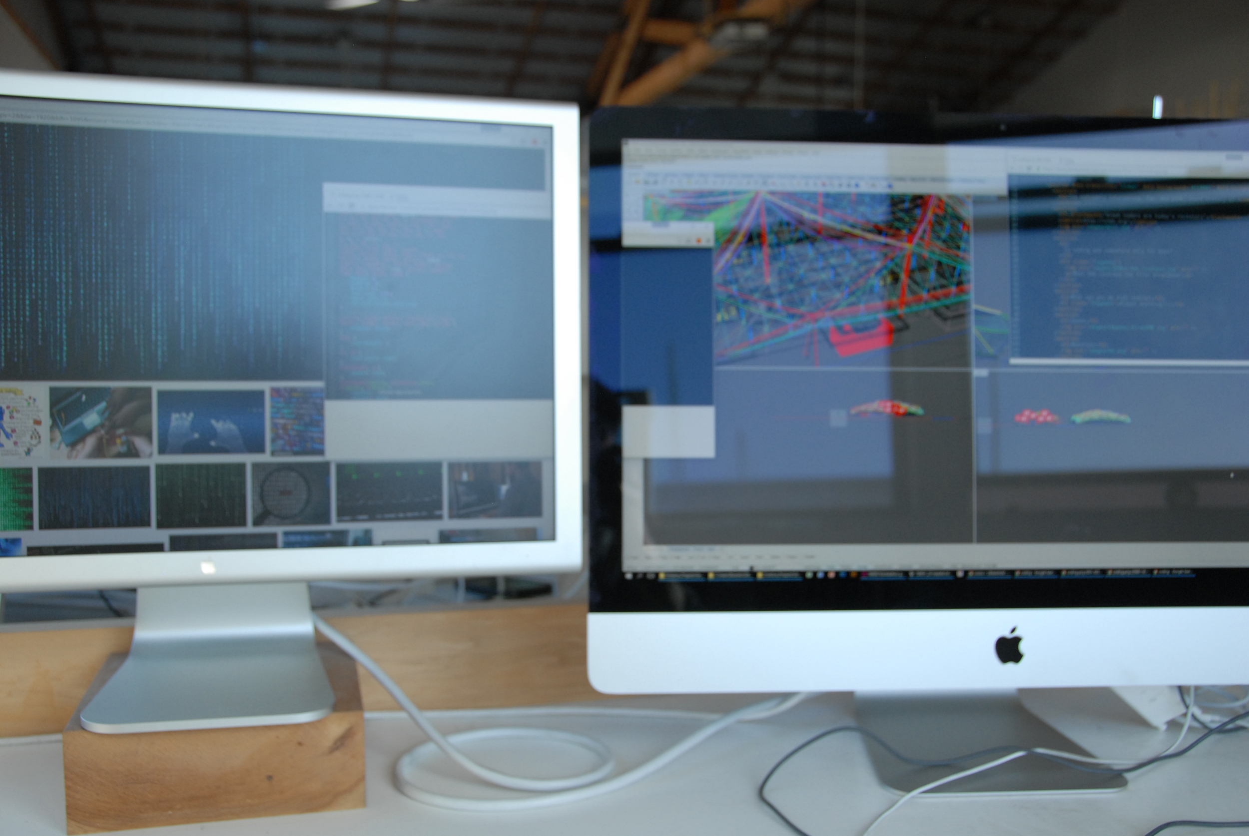
If there were no partitions on level 2, veiling reflections would be pervasive across the floor plate except where occluded by the cores and corner touchdowns. Annoyance caused by veiling reflections can be reduced through a range of design and operations responses including partition placement and height, user adjustment of monitor tilt angle and placement, and use of matte monitor screens or films.
Example of low angle sun through shades causing glare at a workstation.
Veiling reflections in anti-reflective (left) vs. reflective (right) monitor.
We recommended that the potential to implement a mitigation measure be gracefully designed into the soft architecture and workstations, but that the implementation would not necessarily be deployed on Day 1. Since annoyance caused by a view to low-angle sun through shades and veiling reflections are heavily dependent on user preference and tolerance, Google facilities would have to be response to user needs and understand the full pallette of possible solutions including:
1. automated fabric shade control
2. preferred workstation orientations
3. flexible partition size and layout
4. localized workstation glare control
5. fine-tuned user adjustment of workstation, keyboard, and monitor(s)
6. monitor selection
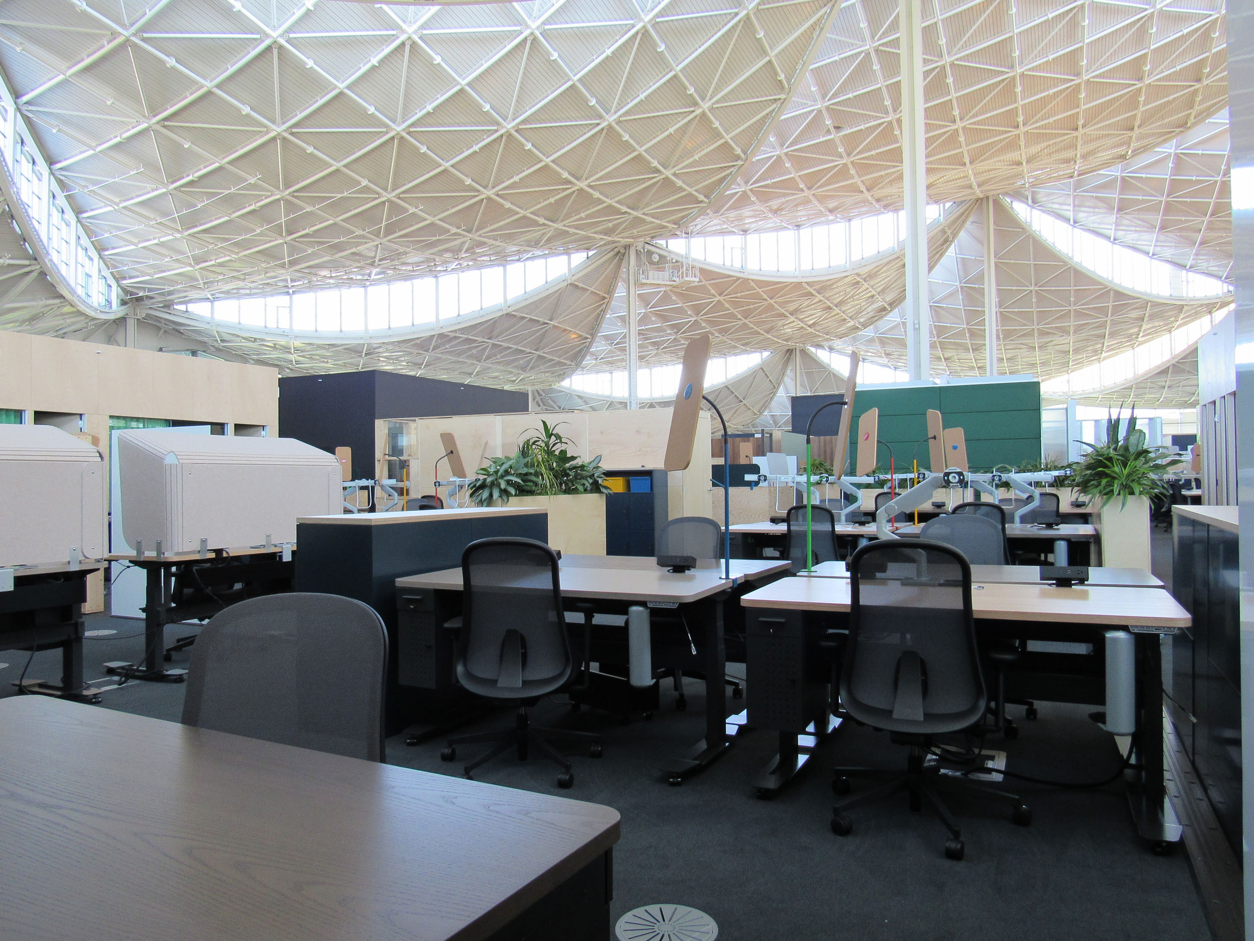
A range of “human scale” glare mitigation devices were designed to maximize visual comfort under the canopy while still allowing daylight and views. In addition to the automated fabric shades, the building includes a variety of demountable partition systems, vegetation, bookshelves, desk shrouds, and clip-on visors.
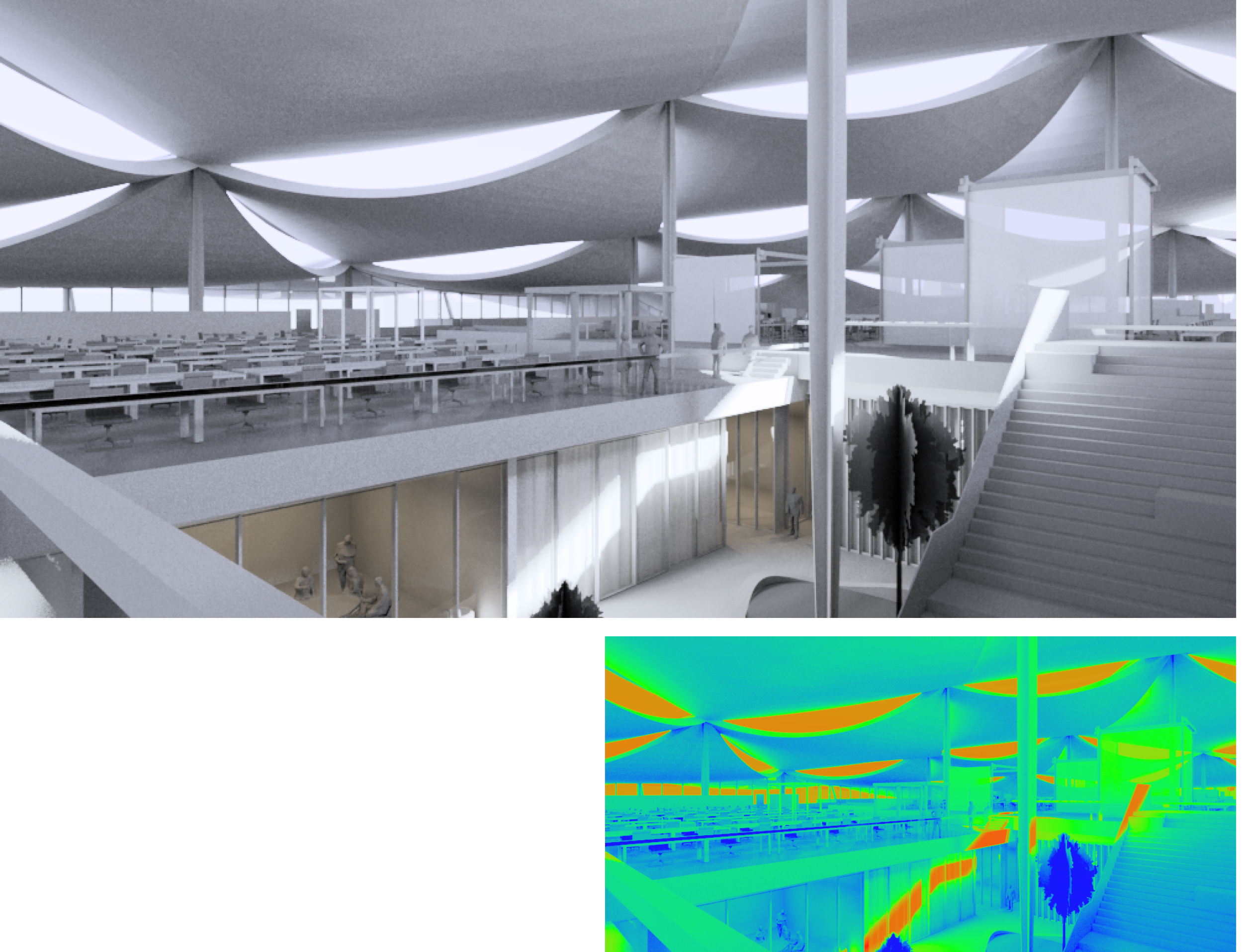
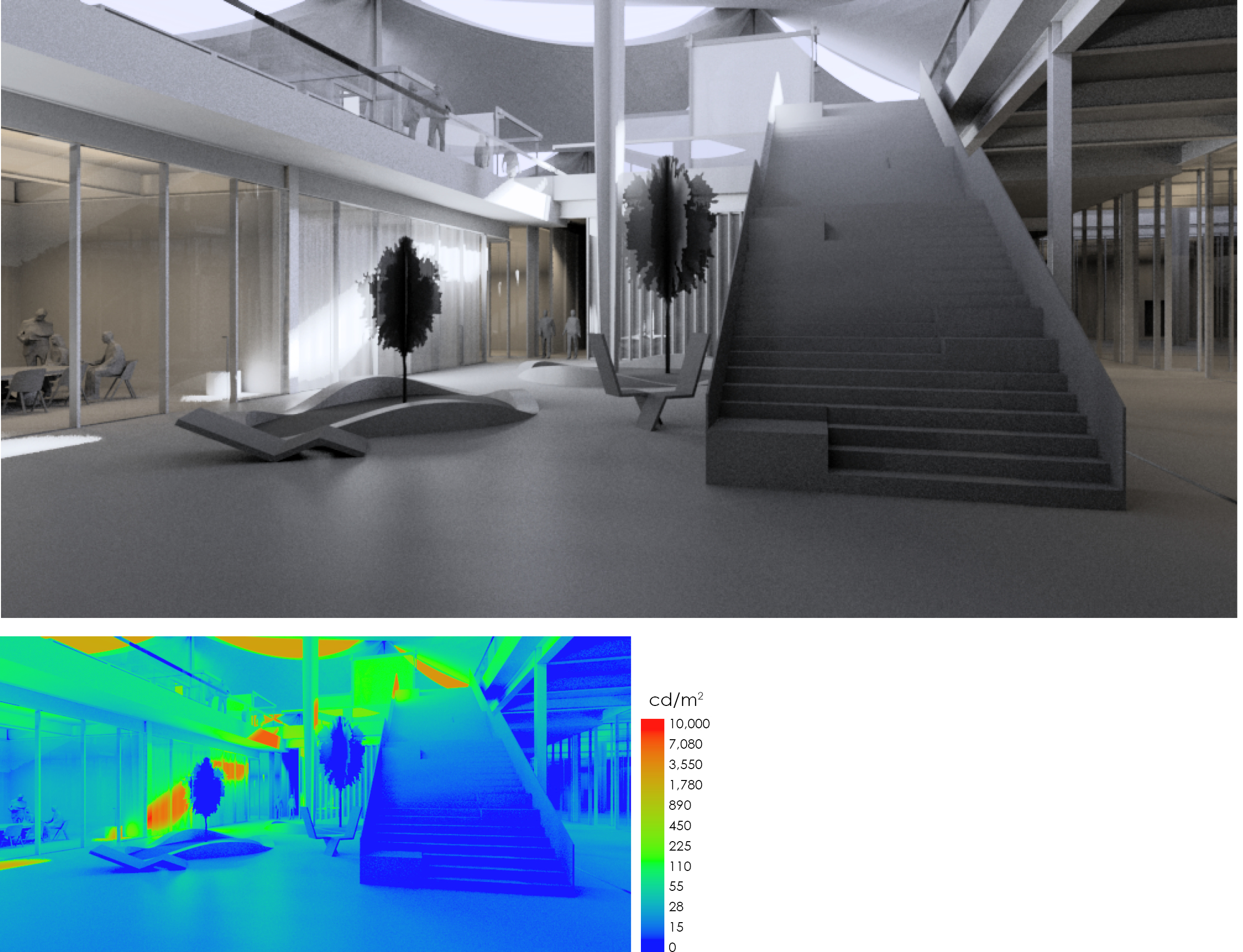
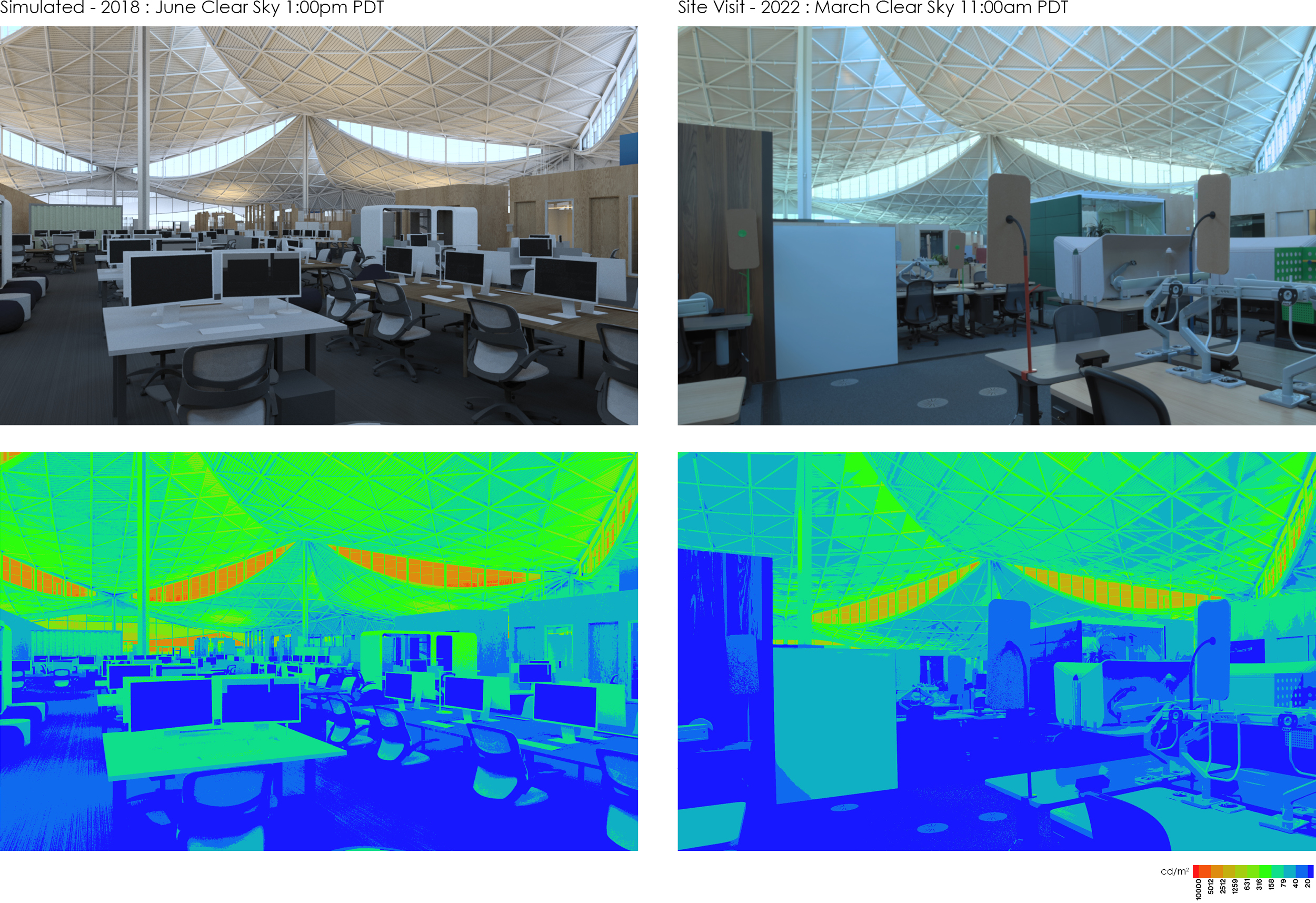
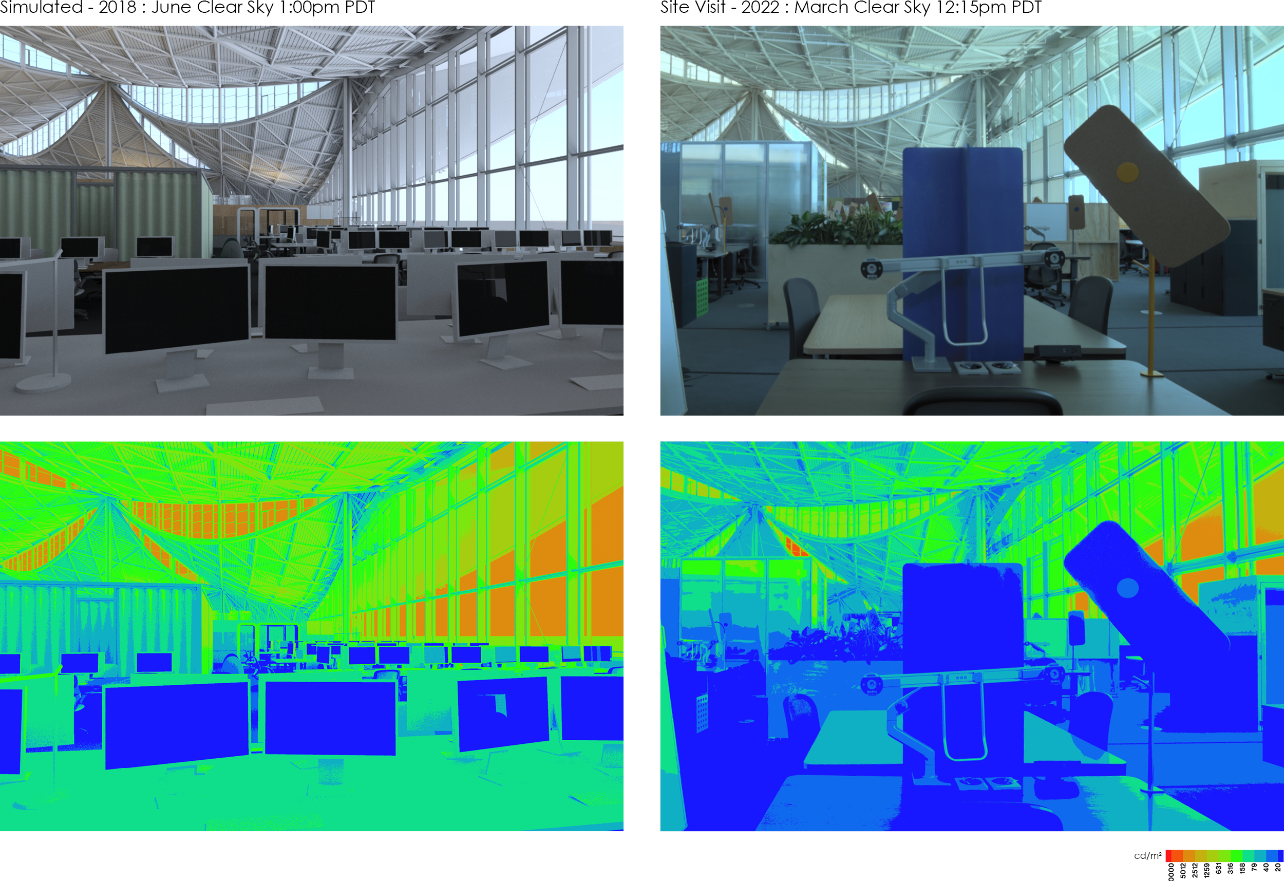
In the last phase of the project we verified the quantity and quality of light throughout the buildings to see if our design-phase simulations accurately predicted the built result. We found a highly successful series of interior spaces with comfortable views in all directions. We also found remarkable agreement between the predictions in our simulations and the built reality. In the images below, the left-hand images are the design-phase simulations and the right-hand images are the as-built photographs. The false color images show luminance, or surface brightness in cd/m2. The sky brightness was slightly different between the simulation and as-built, which accounts for the color temperature and brightness differences. Otherwise, these images show the degree to which we are able to predict luminous performance in a highly complex building. This ground truth check on the accuracy of simulations is critical for clients to trust our work and our recommendations.
Project Details
LOCATION: Mountain View, CA
ARCHITECT: Bjarke Ingels Group and Heatherwick Studios
Executive Architect: Adamson Associates
Interior Architect: Studios Architecture
Status: Occupied, 2022
Area: 1.1 million sf
Photography: Iwan Baan and Bruce Damonte
